TRANSNETYX
Reimagining the filter, sort, and group process, transforming complexity into clarity and boosting efficiency.

Role
Duration
Industry
Skills
Product Designer
User Research
Product Strategy
Biotechnology
November 2024 - February 2025
Reimagining the filter, sort, and group process, transforming
complexity into clarity and boosting efficiency.
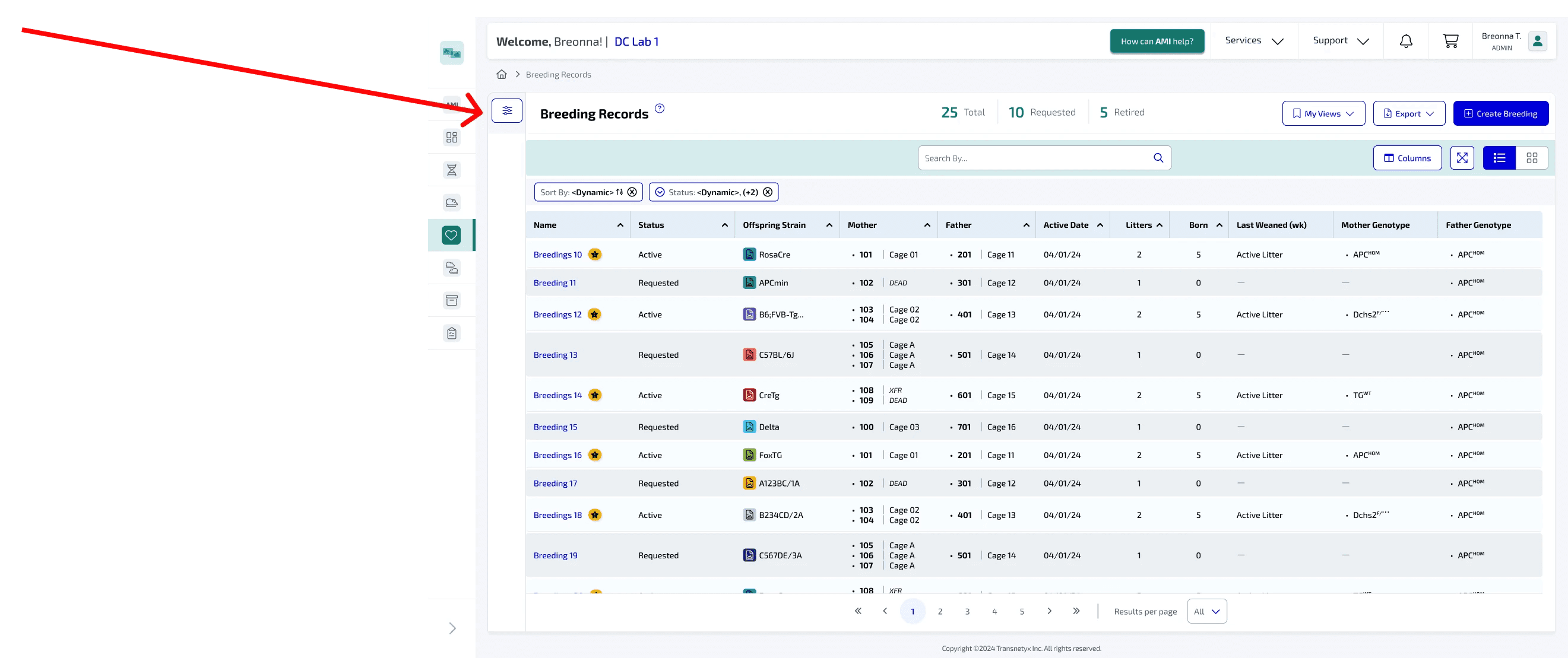
Problem
Imagine managing a large volume of genotyping data with your research team, only to find that locating specific information has become increasingly challenging. While Transnetyx offers a filter, sort, and group system to help organize the data, the navigation process was unclear and inefficient. My goal was to enhance this experience by improving the clarity and ease of navigation, ensuring that researchers could quickly find and analyze the data they needed.
99.7%
Result accuracy
45 million
Samples genotyped
$25 M
Profit by 2030
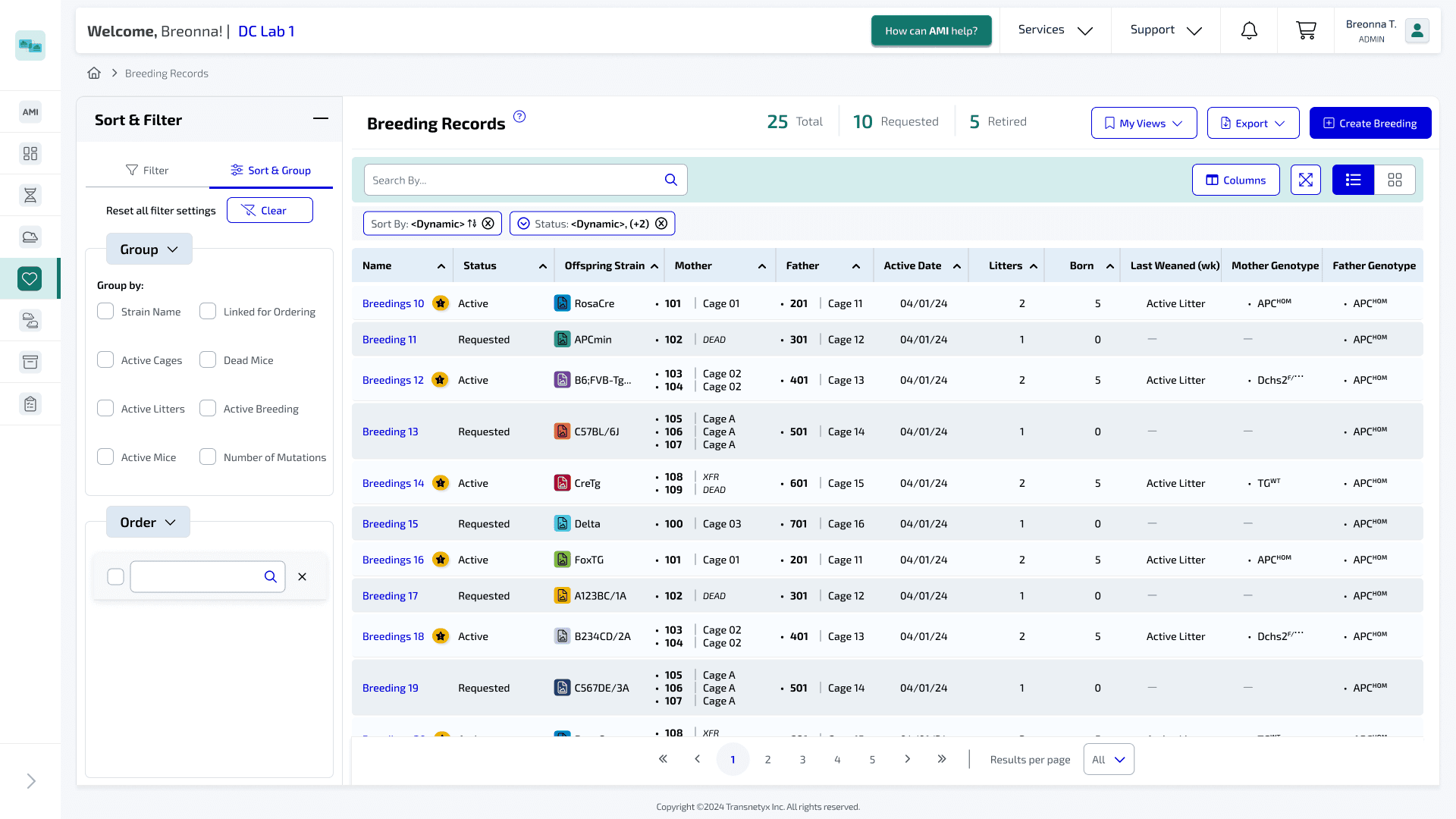
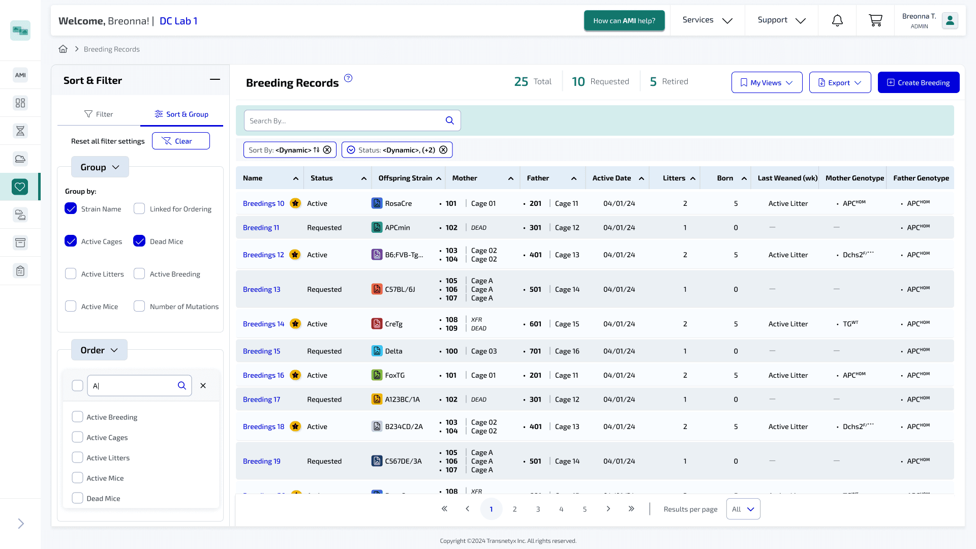
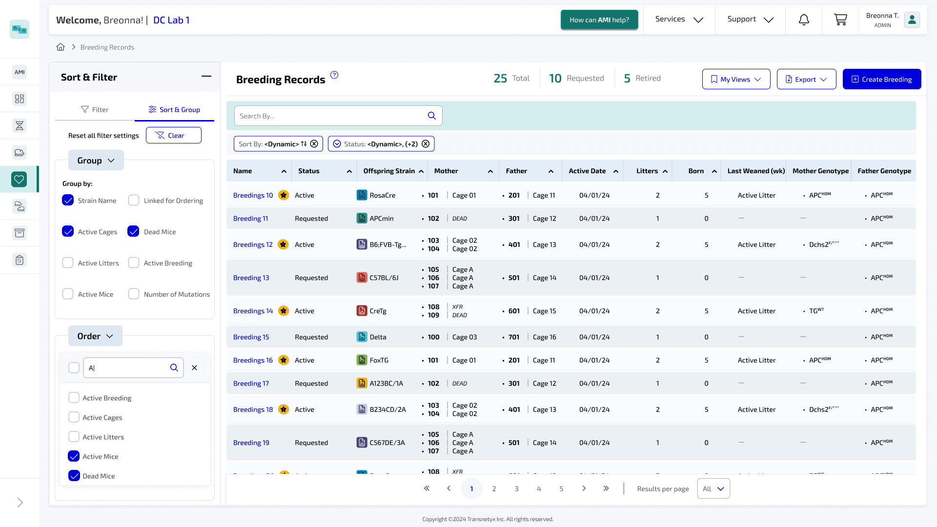
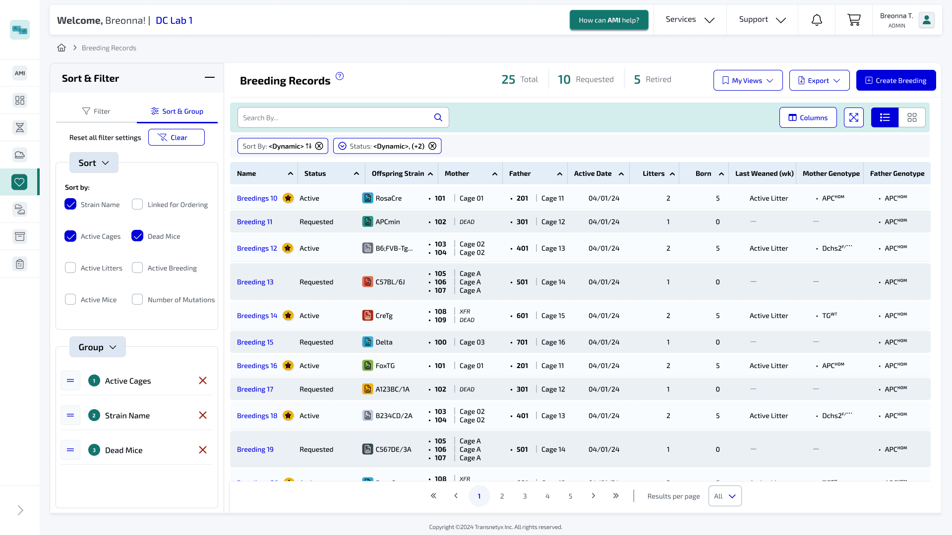
Solution
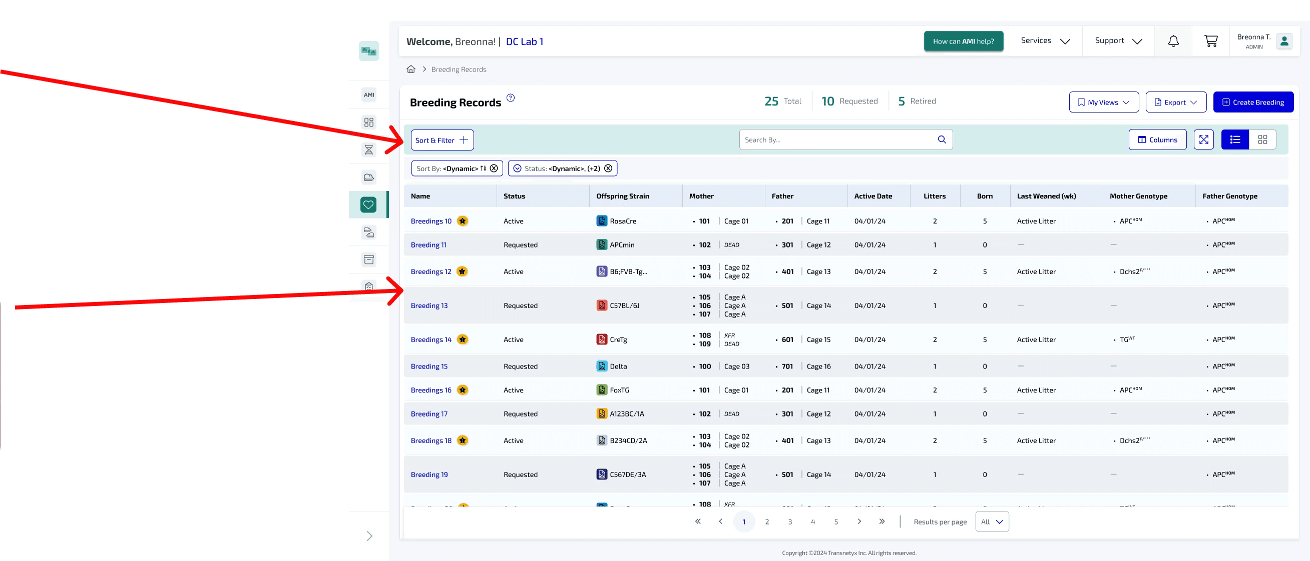
I designed an intuitive filter, sort, and group system integrated into a permanent, collapsible panel on the left-hand side of the interface. This allowed for a
cleaner, more streamlined user experience. Simultaneously, I carefully analyzed the original concept, selectively removing certain design elements to create a
fresh, modern look that enhances usability while maintaining the core functionality.
Research

Met with product manager to discuss my
role on the team, main issue users are
facing, expectation of the project and goal.
Target Audience: Researchers at various institutions who test samples to drive advancements in human health.
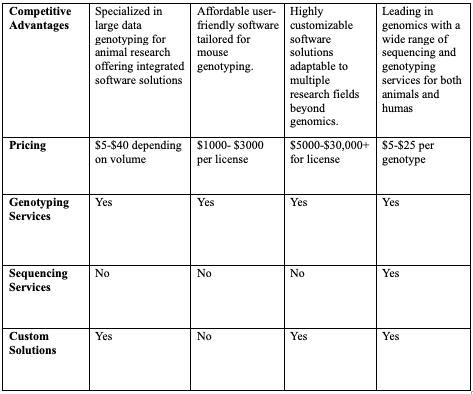
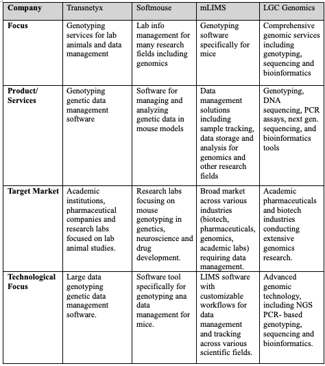
Competitive Analysis
Performing a competitive analysis of the
biotech industry comparing Transnetyx to
companies that offer similar products/ services
to their clients.
Iteration Process
During the iteration process I performed three rounds of designs
until I got to the final version of the design that was suitable for
both the users needs and the companies needs.
Iterations
Started design with a simple
sort and filter button on the to
conserve space leaving room
for other buttons or valuable
screen space for data on the
table.
Changed design from a simple
filter button to a label "Sort &
Filter" with a plus sign. This
allows for the user journey to be
much clearer to the Sort and
filter panel. The plus sign was
added to correlate with the
minimize button when the panel
is in its open state.
Also removed the white space
between the filter panel and the
side navigation allow freeing up
screen space for the data table.
Iteration #1
Iteration #2